Navigate to the stock you're interested in by entering its detail page.
Scroll down to the liquidity distribution section.
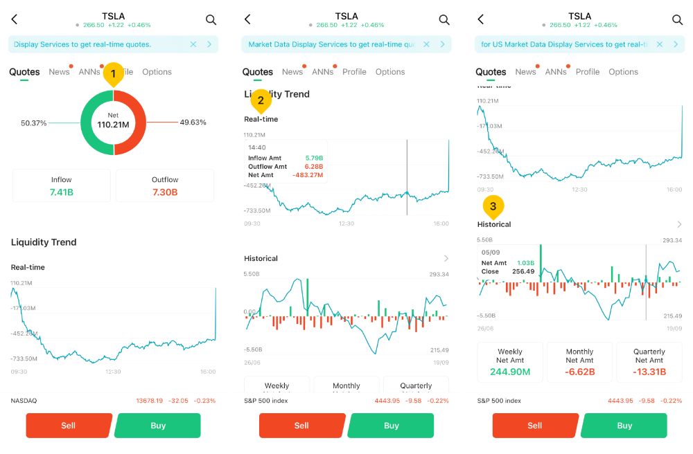
In the Liquidity Distribution section, you can view the exact inflow and outflow amounts for relevant stocks, along with their proportions in the pie chart. The center of the chart displays the net capital, calculated by subtracting outflows from inflows.
The Real-time liquidity trend chart presents the stock's fund flow curve throughout the day. A long press activates crosshairs and floating windows, displaying the inflow, outflow, and net fund amounts at specific times. The horizontal axis presents market opening and closing time, while the vertical axis presents the cumulative capital flow amount of the day (the cumulative inflow or outflow amount of the day).
The "Historical Capital Flow" section provides the latest 60 trading days capital flow data. By long-pressing the chart, you can activate crosshairs and a floating window that displays the net fund flow value and the closing price for a specific time period. The horizontal axis presents the 60-day data, while the vertical axis presents the Net Amt (i.e. net daily capital flow) and Close (closing price).
Below the historical capital flow chart, you can easily visualize the net capital amounts on a weekly, monthly, and quarterly basis, aiding you in tracking market movements across these time frames.
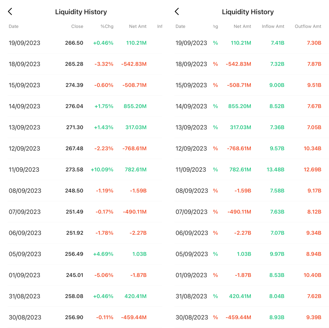
Furthermore, tap the "More" icon located on the right side of the historical capital flow chart to access daily capital flow details, and you have the option to swipe horizontally to explore additional data.