Price charts are at the heart of trading. In addition to helping traders monitor the value of their current positions, they also help traders see where the price has been, and in doing so, provide clues as to where the price will go. As such, understanding how to read a price chart is a key step in the journey of becoming a seasoned trader. Here are the three most popular types of price charts:
1. Line chart
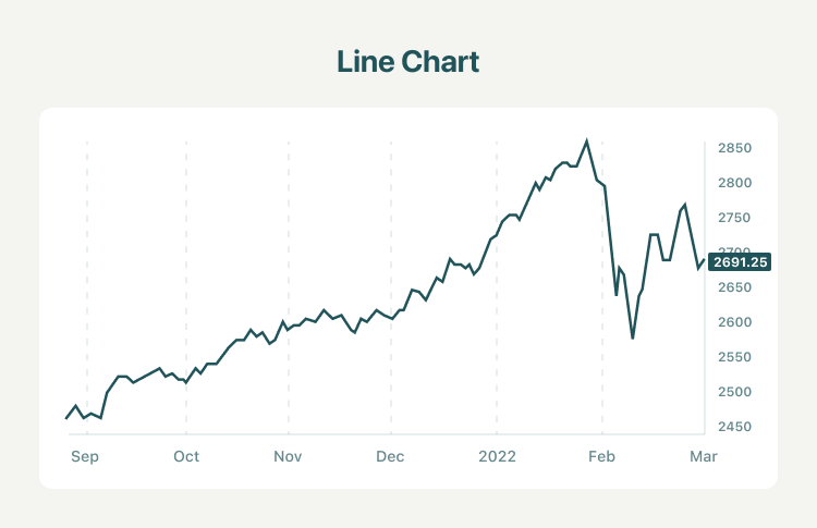
A line chart consists of a single line that maps the movements in the closing price of the stock. It is widely used to get a basic idea of the trends in stock prices. This chart does not show much and may not give you much material but it gives you a general idea of the price trend.
2. Bar chart
A bar chart is a little more complex. It consists of multiple price bars, with each bar illustrating how the price of an asset or security moved over a specific time period. Each bar typically shows open, high, low, and closing (OHLC) prices.
Each bar has a vertical line that shows the highest and lowest price reached during the period. The opening price is marked by a small horizontal line on the left of the vertical line, and the closing price is marked by a small horizontal line on the right of the vertical line. As shown below:
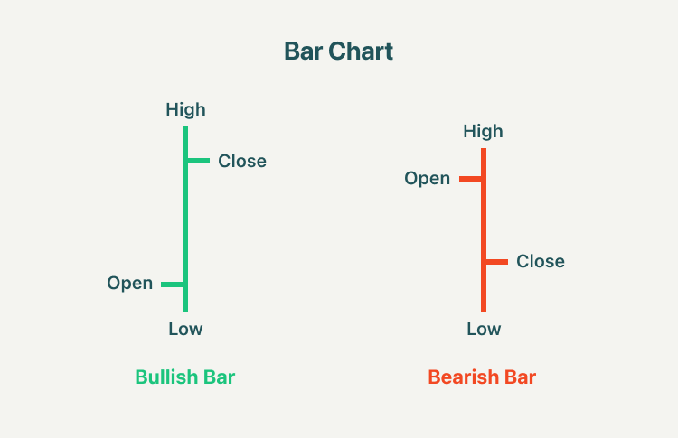
Bar charts help a trader see the price range of each period, and the bars may increase or decrease in size from one bar to the next, or over a range of bars. As the price fluctuations become increasingly volatile, the bars become longer. As the price fluctuations become quieter, the bars become shorter.
3. Candlestick chart
A candlestick is a type of price chart used in technical analysis that displays the high, low, open, and closing prices of a security for a specific period. As seen below:
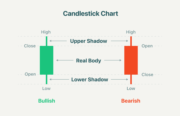
The candlestick has a wide part, which is called the "real body". This real body represents the price range between the open and close of that day's trading. When the real body is filled in red, it means the close price is lower than the open. If the real body is green, it means the close price is higher than the open. A Doji is a name for a trading session in which a security has open and close levels that are virtually equal.
4. Charting on Different Time Frames
The technical analysis time frames shown on charts range from one-minute to monthly, or even yearly, time spans. Popular time frames that technical analysts most frequently examine include:
- 5-minute chart
- 15-minute chart
- Hourly chart
- 4-hour chart
- Daily chart
The time frame a trader selects to study is typically determined by that individual trader’s personal trading style. Intra-day traders, traders who open and close trading positions within a single trading day, favor analyzing price movement on shorter time frame charts, such as the 5-minute, 15-minute charts, or 30-minute. Long-term traders who hold market positions overnight and for long periods of time are more inclined to analyze markets using hourly, 4-hour, daily, or even weekly charts.
Summary:
- A line chart consists of a single line that maps the movements in the closing price of the stock. It is widely used to get a basic idea of the trends in stock prices.
- Line charts are ideal for beginner traders to use due to their simplicity, but line charts may not provide enough price information for some traders to monitor their trading strategies.
- A bar chart consists of multiple price bars, with each bar illustrating how the price of an asset or security moved over a specific time period.
- As the price fluctuations become increasingly volatile, the bars become longer. As the price fluctuations become quieter, the bars become shorter.
- A candlestick is a type of price chart used in technical analysis that displays the high, low, open, and closing prices of a security for a specific period.
- The candlestick has a wide part, which is called the "real body". When the real body is filled in red, it means the close price is lower than the open. If the real body is green, it means the close price is higher than the open.
- The technical analysis time frames shown on charts range from one-minute to monthly, or even yearly, time spans. The time frame a trader selects to study is typically determined by that individual trader’s personal trading style.